Defining the major problems:
Nested settings and popups for main actions.
No clear visual guidance for users for possible/next actions.
No time spent on the dashboard.
Features and designs are outdated.
Solutions to pursue:
Streamlined, step-by-step flows. Optimized for speed and successful execution.
Designed a new dashboard that helps users with daily actions and shows the most important stats at first glance.
Updated features and UI based on competitor analysis and benchmarking.
Outcomes & Achievements:
Test users were able to complete high-priority daily tasks with little to no questions and with a shorter learning curve.
They started to spend time on the dashboard.
They were easily able to adapt to the new UX/UI.
Competitor Analysis, Benchmarking, and UX Audit:
We created a benchmark document in which we analyzed our current product, studied the government regulations, and researched our global competitors. We also included a mood board and UI benchmarks. Then, I analyzed every feature and action flow and compared it with our competitors to learn how they handle similar situations.
In the meantime, we checked in with the stakeholders to make sure the new feature set is a true upgrade without any compromise
Simplifying Complex Flows:
Main flows like creating an invoice were full of hidden settings. Options have stacked up as the product evolved in developers' hands. Also, there was no order of action, all were available initially - which confuses users, causes dropouts, and creates a load on customer support.
In this example: new steps unlock as the user progresses through the questions. Eliminates problems that might arise from conditional elements. Guides users with minimal inputs and expands if further detail is needed.
Also, cases where users leave the page to add prerequisite information - such as a new client or product - are all handled within the page. Further enhances UX and helps users to finish their tasks.
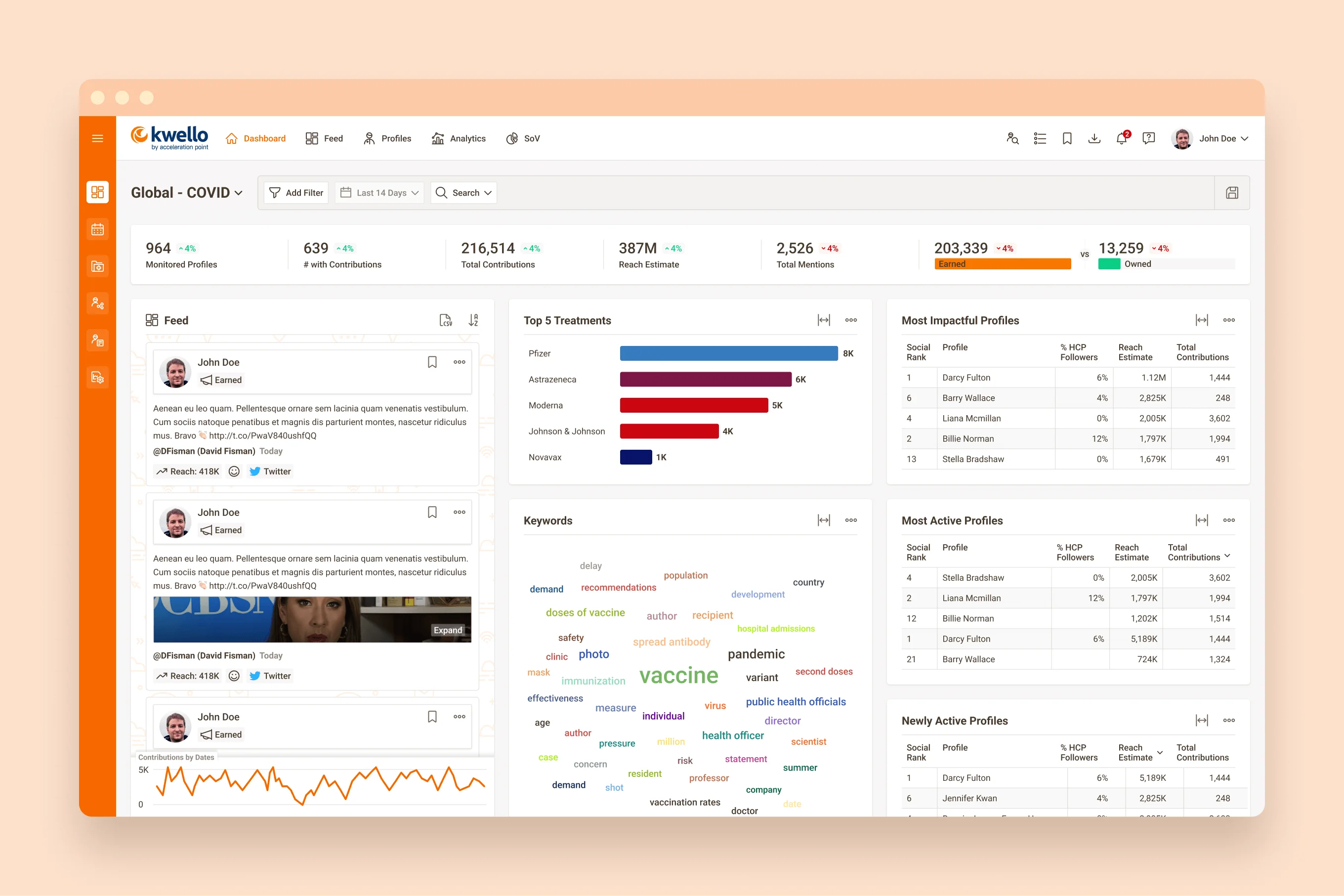
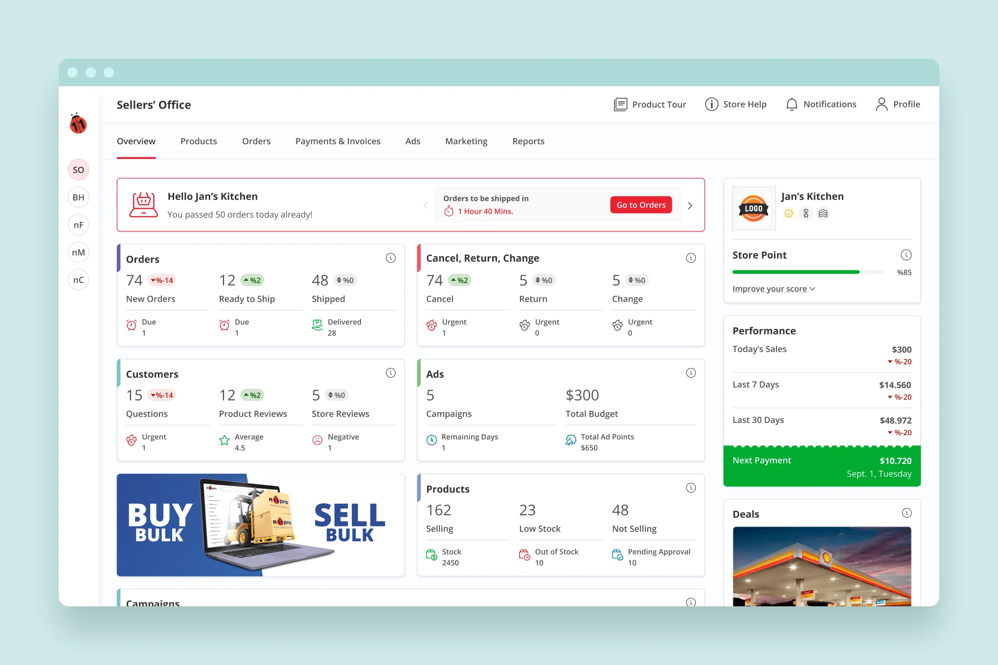
New Dashboard:
The old dashboard was a combination of a few reports. Users only looked at it occasionally when they wanted to check certain metrics. So, the new objective was to help users with their daily tasks. Show reminders, due and upcoming activities. Show only high-priority data to keep the page short. In brief, the new hub of their operations.
It transformed from an abandoned page into an important place users visit to see what is happening.
Old vs. New:
Tables are one of the most important components of this product. On the old product, most of them had horizontal scrolls even on HD screens. The new design adds much needed features like bulk actions, is very clean and legible, and fits even the smallest screens without any compromise. Same data, same labels, same filters, on all screens.
Meticulously Crafted UI:
One of the goals of this project was to design a brand-new, expandable, consistent UI with components and interactions documented for sustainable design progress in the future.
The brand had red as the primary color. Blue and its hues were introduced as complementary colors, along with other necessary colors for labels, warnings, etc. All the colors were chosen based on contrast ratios to ensure they give the intended impact when seen on screens. Also, all comply with the accessibility standards.
Fully responsive:
The new designs are optimized for mid-size desktop screens. But they are 100% responsive. The default view for 1280px screens has no less content area than 1440px screens! So, there is not a single screen that hides/shows the content based on screen size.